Morse Code Tattoo
A morse code tattoo turns a word into a line of dots and dashes — private to everyone except the person who knows what it says, or who spends thirty seconds with a translator. It is one of the few tattoo styles where the design is derived rather than drawn, which makes it unusually easy to get subtly and permanently wrong. This page covers what people actually get, the design decisions that matter, how the code ages in skin, and the one check that separates a piece that reads correctly from one that quietly says something else.
👀 Preview
Press ▶ Play — this shows what you'll see and hear.
Customize your message
Your picture appears in Play and downloaded videos. Note: it can't be included in a shared link — links carry the message only.
Share as a secret message
The message is hidden inside the link and decodes with sound & light when your friend opens it.
What people actually get
The same handful of choices come up over and over.
A name. A child, a partner, a parent, someone lost. Comfortably the most common.
A date. A birth, an anniversary, a day that mattered. Digits are always five marks each in Morse, so a date is long but visually regular — which some people like precisely because it looks deliberate rather than random.
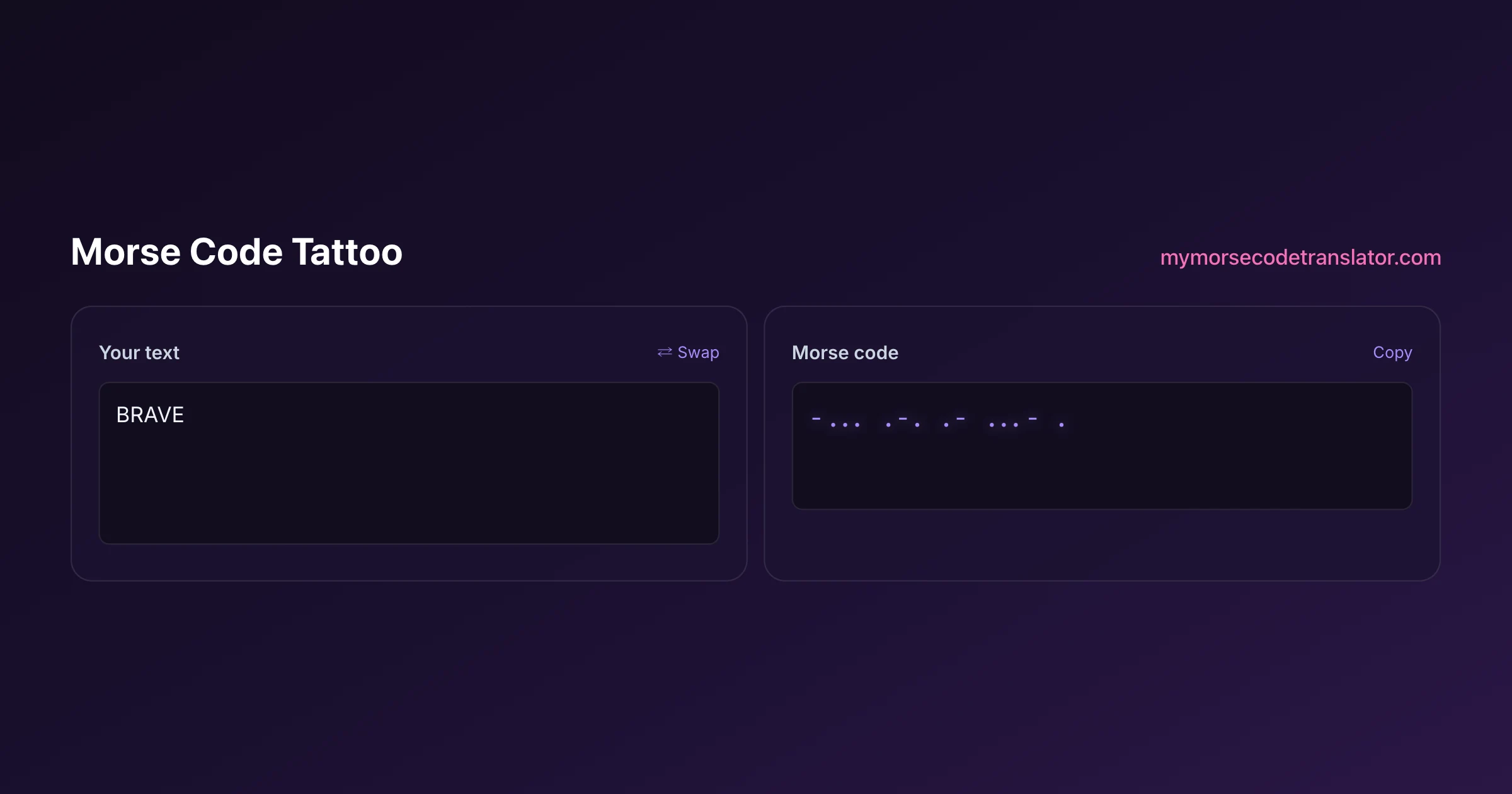
A short word. BRAVE, HOPE, STAY, BREATHE, ENOUGH, ALWAYS. These carry well because they are short enough to stay legible.
Initials. Two or three letters, often for family. The smallest and most wearable option.
Coordinates. A place, in digits. Long, but people who want them usually want the length.
A private phrase. Something only one other person understands. This is really the whole appeal of the format — a message you wear openly that nobody can read over your shoulder.
The practical ceiling is around six or seven letters before the piece has to get either very long or very small, and small is the enemy here for reasons the ageing section explains.
The design decisions that actually matter
Three choices determine whether the piece still reads in ten years, and none of them are about style.
Make the dash unambiguously longer. The standard is three times the dot. On skin, aim for more than three — four or even five. Ink spreads, and a dash that is only just longer than a dot on day one will not be distinguishable later.
Make the letter gaps obviously wider than the mark gaps. This is the one people get wrong most. Morse depends on three gap lengths, and if the space between letters looks the same as the space inside a letter, the piece becomes genuinely ambiguous rather than merely hard to read. Some designs solve it with a small vertical tick or a colour shift between letters.
Go bigger than feels necessary. Every ageing problem is a spacing problem, and spacing survives at scale. A piece at 12cm will still read when the same design at 5cm has closed up.
Style choices — filled circles versus outlines, bars versus rectangles, a fine line running through the marks, art deco framing — are genuinely free. They do not affect legibility as long as the three rules above hold.
Placement, and how the body affects it
Morse is a long, thin thing, which narrows the sensible options.
Forearm, inner or outer. The most common. Straight, flat enough, easy to show or cover, and ages relatively well.
Wrist. Popular and the riskiest of the common choices — small area, constant sun, constant movement, and the skin is thin. Expect it to soften faster than anywhere else.
Collarbone or ribs. Naturally suit a long horizontal line. Ribs hurt considerably more and the skin moves, which can distort spacing over time.
Spine or along the shoulder. Handles longer words without shrinking them, and stays out of the sun.
Finger. People ask; the honest answer is that finger tattoos fade and blow out faster than anywhere else, and Morse depends on precise spacing. It is the worst possible combination.
One more consideration: curvature. A forearm is a cylinder, so a design that reads perfectly flat on paper compresses at the edges when it wraps. Ask your artist to account for it, or keep the piece within the flattest plane.
How ink ages, and what that does to the code
This is the part that separates a Morse tattoo from an ordinary one, and it is rarely mentioned.
All tattoos spread. Ink migrates slightly into surrounding tissue over years, so lines thicken and small gaps close. On a script tattoo that reads as softening. On a Morse tattoo it attacks the exact thing carrying the meaning.
Two specific failures follow. Dots grow toward dashes, so a three-to-one ratio drifts toward two-to-one and eventually becomes a judgement call. And gaps close, so letters that were separate merge into one unreadable run.
The practical consequences are all decisions you make before the needle:
- Oversize the dash-to-dot ratio deliberately.
- Oversize the letter gaps deliberately.
- Go larger overall than the design looks like it needs.
- Prefer solid, well-defined marks over very fine linework, which fades first.
- Keep it out of the sun, or use sunscreen on it — UV is the single biggest factor in how fast it degrades.
A piece designed with margin still reads decades later. One designed to be exactly correct on day one is designed to fail.
The check that prevents a permanent mistake
One habit, and it is the reason this page exists.
Take the exact dots and dashes from the final artwork and decode them backwards before anyone touches you.
Not read forwards against a chart — forwards you see what you already expect. Backwards you see what is actually there.
Run it specifically when: the artist laid out the pattern rather than you, the design came from a Pinterest image, you assembled it by hand from a chart, or the word contains a doubled letter.
That last one deserves its own warning. EMMA, HANNAH, MOLLY, AARON, BREATHE — any repeated letter is where a mark most often goes missing, and the result is a shorter word that still looks entirely plausible. That is exactly why nobody catches it. A missing bead can be replaced; a missing dot cannot.
The morse code tattoo generator produces the pattern to hand over, with the pre-needle checklist. And paste the final marks into the decoder on this site as the last step — it takes thirty seconds and it is the only thing standing between a meaningful tattoo and a permanent typo.
Working with your artist
Most tattooists have not done many of these, and that is fine — the job is straightforward as long as they are given the right thing.
Hand over the pattern, not the word. If you give an artist "BRAVE" and let them look it up, you have delegated the spacing decisions to someone who may not know that letter gaps must be visibly wider than mark gaps. Give them the dots and dashes.
Specify the spacing visually at final size. "Three units between letters" means nothing on skin. Print the design at the actual dimensions and mark the gaps on it.
Show them the dash-to-dot ratio you want and say explicitly that you would rather the dashes were too long than too short.
Ask for a stencil check. Photograph the stencil on your skin and decode it from that photo before the first line goes in. This is the last free chance to catch an error, and any good artist will happily wait two minutes.
Discuss ageing. Ask how they expect it to spread at that size on that body part. An experienced artist will have an opinion and it is worth hearing.
Matching and couple tattoos
A common request, and one worth a moment of thought beyond the usual.
The format lends itself to it: two people with the same short word, or complementary halves of a phrase. It reads as abstract to everyone else, which is much of the appeal.
Two practical notes. Get them done at the same size and by the same artist if you can — two versions of the same pattern at different scales will age differently and stop matching, which tends to bother people more than they expect.
And decode both before either is started. Matching tattoos with the same error are still wrong, just symmetrically.
The less comfortable point is the same one that applies to any name tattoo: Morse does not make it less permanent, it just delays the moment somebody asks what it says. If the answer to "would I still want this if things changed" is uncertain, a word rather than a name is the version people regret less.
Small tattoos and why they fail
The single most common regret with this style is going too small, so it gets its own section.
Morse is a ratio system. Its entire meaning lives in relative lengths — dash to dot, gap to mark. Shrink the design and every one of those ratios has to survive at a smaller absolute size, while ink spread stays roughly constant in absolute terms.
That is why a 4cm wrist piece and a 12cm forearm piece do not age proportionally. The spread that softens the large one destroys the small one, because the same fraction of a millimetre closes a gap that was only a millimetre wide.
If you want something discreet, the better moves are a shorter word, a hidden placement, or finer overall styling at a normal size — not a miniature version of a long word. A three-letter word at a readable size stays private and stays legible. A seven-letter word shrunk to fit is a grey smudge in fifteen years.
This is the one place where the advice genuinely conflicts with what most people want, and it is still the right advice.
Before you book
A short list, in order.
- Choose the word, and prefer six letters or fewer.
- Generate the pattern rather than copying it from an image you found.
- Decode it backwards and confirm it returns exactly what you meant.
- Check doubled letters specifically.
- Print at final size and look at it on the actual body part.
- Confirm the dash-to-dot ratio is generous, not exactly three.
- Confirm the letter gaps are visibly wider than the mark gaps.
- Hand the artist the pattern, with the spacing marked.
- Decode the stencil photo before the first line.
Every item on that list came from a mistake somebody actually made, and all of them are free to fix beforehand.
One standards note worth confirming with your artist: the pattern should be International Morse, the version fixed by the ITU in recommendation ITU-R M.1677 and used by every modern translator. A design copied from an old chart found online may quietly use American Morse, an obsolete variant that differs on about a dozen letters and puts gaps inside some characters. The marks would be tattooed perfectly and the word would still be wrong.
If you want it on something removable first
A reasonable instinct, and there is a sensible path.
Wear the same pattern as jewellery for a while before committing it to skin. A morse code bracelet uses exactly the same dots, dashes and spacing logic, costs a fraction, and tells you two useful things: whether you still like the word after six months, and whether the length works on your body at all.
A temporary tattoo of the final artwork is the other option, and it is genuinely worth the small cost — it shows you how the piece sits on the curve of the limb, which a flat printout cannot.
And if the appeal is the hidden message rather than the ink specifically, send a secret morse message does the same thing as a link that beeps and flashes when the right person opens it. Not permanent, but a good deal easier to change your mind about.
The one I was asked to check late — stencil already on the arm — had the letter gaps and the mark gaps drawn identically, so the whole thing read as one continuous run rather than five letters. The artist widened four gaps in about a minute. Had it gone in as drawn it would have been technically correct dots and dashes that decoded to nothing.
Frequently Asked Questions
Q. What is a morse code tattoo?
A tattoo that spells a word in dots and dashes instead of letters, so it reads as an abstract pattern to anyone who does not know the code. Names, dates and short words are the most common choices.
Q. How do I make sure it says the right thing?
Decode it backwards. Take the exact dots and dashes from the final artwork, paste them into a decoder, and confirm the text that comes back is what you meant. Reading forwards against a chart only shows you what you already expect.
Q. How big should a morse code tattoo be?
Bigger than feels necessary. Ink spreads over years and it is the gaps that close first, so a small piece degrades into an unreadable run while the same design at a larger size stays legible. Prefer a shorter word over a shrunken long one.
Q. Where is the best placement?
Forearm, collarbone, ribs or along the spine all suit a long thin line. Wrists are popular but age fastest, and fingers are the worst option — they fade and blow out, and Morse depends on precise spacing.
Q. Why do some morse code tattoos become unreadable?
Because the letter gaps were the same width as the gaps inside a letter, or the dashes were only just longer than the dots. Both problems get worse as ink spreads, so a design that was marginal on day one becomes ambiguous rather than merely faded.
Related guides
← Back to the My Morse Code Translator home page.

By Sukie
Sukie is the creator of My Morse Code Translator — a puzzle nerd and gadget tinkerer who fell down the Morse code rabbit hole and decided to build the most fun Morse translator on the web. When she's not adding new sound packs or reveal animations, she's decoding hidden messages in songs or designing Morse code bracelets for friends.
Last updated: 2026-09-08